April 27: Is the Subway Getting Better?
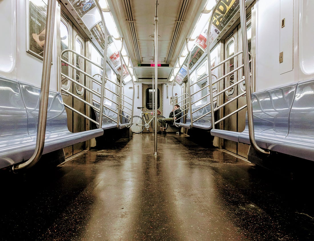 Photo by Aaron Gordon
Welcome to Signal Problems, a weekly newsletter helping you figure out what is going on with the subway. I’m Aaron Gordon, transit reporter for the Village Voice. If you’re a new or prospective subscriber, head over to the Subway Knowledge Base page for an introduction to the state of the subway.
As always, send any feedback, subway questions, or Dog in a Bag photos to aaron.wittes.gordon@gmail.com. I’d love to hear from you. As someone on a stalled Q train once told me, we’re all in this together.
Is the Subway Getting Better?
When I started this newsletter in January, I did so in part because people kept asking me the same question over and over: when will the subway get better? At the time the newsletter began, the subway crisis had been a recognized thing for about eight months. The Subway Action Plan, an $836 million emergency measure designed to put an end to the crisis, was about five months old. When announcing the plan, MTA Chairman Joe Lhota promised results within one year. Understandably, people just want to know when their commute wouldn’t suck.
The closest the general public gets to answering this question is in the monthly board books. Every month, the MTA board and the individual committees—such as the one for Transit, Metro North and LIRR, Bridges and Tunnels, Capital Construction, etc.—meet. Those board/committee members receive briefing books, a portion of which is dedicated to reporting on the transit system’s performance.
While anyone can view these hefty documents, they’re laden with transit jargon and unexplained acronyms. They’re also very much written to instill confidence in the transit system.
The subway runs some 8,000 trains every single day, and 250-300 incidents delay about one-sixth of them. Which is to say, it takes work to figure out how the subway is really doing. It’s something that simply can’t be summarized with one or two statistics.
The good news is I’m going to do that work for you and boil it down as simply as I can right here in this newsletter.
This will involve changing things up a bit. Once a month—the first newsletter edition after the board materials are released and the board holds their meeting—I’ll spend the vast majority of the newsletter answering that one question: is the subway getting better? Naturally, it won’t be a simple yes or no, but I’ll try and get us as close to that as possible.
Lost Hours
As I’ve previously written, a good place to start—but certainly not finish—when figuring out how the subway is doing is On-Time Performance (OTP), the MTA’s oldest operating metric. So, let’s get right to it: weekday OTP in February 2018 was 61.7%, down .7% versus February 2017. This falls in line with OTP’s general negative trend since July 2017 when the Subway Action Plan began.
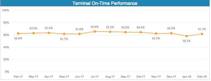 Screenshot from MTA’s Subway Performance Dashboard
February was an improvement over the abysmal January figure but still short of recent months.
The MTA has fancier metrics than OTP, specifically Additional Platform Time (APT) and Additional Train Time (ATT), meant to convey the “average added time that customers spend waiting…for a train, compared with their scheduled wait time.”
These are new stats for the MTA, and the board books specifically state:
This metric uses electronic data made available systemwide by the MTA's investments in new train tracking technology and in more robust methods for determining how customers use the subway. It is likely that this measure will be refined and enhanced as the MTA gains experience integrating the latest technology and information. [emphasis mine]
Or to put it another way: we reserve the right to change these numbers in the future.
That being said, these metrics are sending mixed messages—another reason why I don’t trust them—with APT saying people are waiting more while ATT saying they’re waiting less. How is this possible? The board book makes an observation that begs the question why APT and ATT aren’t just one “Additional Wait Time” stat:
The flip side of the improvements in Additional Platform Time on the 7 is the higher Additional Travel Time due to increased traffic on the local tracks between 74 St and Queensboro Plaza.
Why are these two different stats if one is just capturing the effect of the other? London, for example, just has “Lost Customer Hours,” which captures both the amount of time lost on platforms and trains.
If you’ll permit me to be super cynical for a minute: I think the APT/ATT stats are the way they are because they will look very bad if they did Lost Customer Hours. Let’s just do some back of the envelope math here: if we add APT and ATT for March together, we get two minutes and 43 seconds of additional wait time per trip (although it sure sounds like this only takes into account the platform wait time at the station where customers swipe in, not any additional platforms they may stand on during transfers). In February there were 5.454 million riders per weekday, which means 246,339 Lost Customer Hours per weekday. London had 66,296 LCH’s per day in their latest performance figures, less than a third of the subway’s (although London’s will include weekends which will drag down the average some).
Obviously this is rough back-of-the-envelope stuff, and by no means should these numbers be taken as official stats. They’re ballpark figures. Nevertheless, it doesn’t look great.
The Subway Action Plan Is Working But Not Yet Helping
The very first stat NYCT presents is “Major Incidents,” the one Lhota specifically targeted when announcing the Subway Action Plan. On the surface of it, this makes sense. It’s the major incidents—defined as anything that delays 50 or more trains—that led to everyone freaking out about the subway to begin with; the years of gradually deteriorating service were met with little more than typical New Yorker kvetching.
I have written about the problem of focusing on Major Incidents before for the Voice:
By focusing on “major incidents” — incidents that delayed fifty or more trains — the MTA actually excluded more than 85 percent of subway delays from its target. Instead, it focused on a relatively small category that does not capture the rising delays over the past five years. In fact, the number of monthly weekday major incidents has remained relatively stable since the beginning of 2014.
…
The problem with this approach is obvious from the agency’s own internal data: Not only do major incidents account for a relatively small share of overall delays, but many of them occur for reasons that are not within the MTA’s control. There are, on average, 8,063 weekday delays each month due to “major incidents,” and only 5,372 of those are from so-called internal causes, such as signals or tracks; the rest are due to factors largely outside the MTA’s control, such as passengers on the track, police activity, or inclement weather.
To be fair, it’s likely the MTA’s terrible data-capturing methods—Byford is working on this; more on that some other time—means a lot of those “other” delays are really due to a major incident that happened further up the line the operator didn’t know about. But as of now, it’s impossible to say how many of them.
Either way, this doesn’t excuse the Subway Action Plan’s evaluation being pegged to such a volatile number. Major incidents were up 20 percent in March 2018 versus a year prior, but the board book is careful to note most of that increase was due to bad weather.
I fully understand the MTA can only do so much when it comes to weather, and this winter sure has been unpredictable. But it was completely predictable the number of major incidents each month would be largely dependent on the weather.
I’m not ready to condemn the Subway Action Plan as a total failure because many of the major incidents are weather related, but I’m also not prepared to give it a pass. NYCT made a choice to peg the Action Plan’s success to a highly volatile statistic with wide seasonal changes and it will be judged accordingly.
There is an even more obvious attempt at excuse-making in the section about weekend major incidents. The board book claims two of the 10 major weekend incidents were due to the March For Our Lives protest, as if that was something the MTA couldn’t control. But they could have run extra service for the extremely predictable influx of passengers. Instead, they opted to run precisely zero extra trains or even delay planned work directly affecting the stops closest to the march.
In sum, here is the MTA’s “the Subway Action Plan is working” line:
Comparing July 2017 to March 2018 to the first half of 2017 (before the Subway Action Plan was initiated), weekday major track incidents have declined by 11.1%, weekday major signal incidents have declined by 19.4%, and weekday major subway car incidents have declined by 21%.
Sounds good, right? The problem is basically every other metric points to flat-lining or declining service, something board member Veronica Vanterpool, a de Blasio appointee and long-time transit advocate, pointed out during Monday’s committee meeting. On-Time Performance, Additional Wait Time, Service Delivered, total number of delays, they’re all getting worse, or at the very least showing no improvement.
Byford responded that this was to be expected; all the work being done is resulting in more delays. He characterized the trade-off as short-term pains for long-term gains. He didn’t, however, provide any indication of when the pains stop and gains begin, although he repeatedly emphasized all this and more will gain clarity next month when he releases his big Corporate Plan.
Byford has thus far earned the benefit of the doubt, but he also inherited the Subway Action Plan, and this comes right from the Governor’s office. It’s politically expedient for him to say all the nice things about it, let it ride out, and then get on with his real fixes. I fully expect his Corporate Plan to reflect this logic. It certainly wouldn’t do him any good to challenge the governor. We’ve seen how that goes.
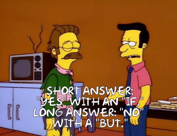
So…Is the Subway Getting Better?
 News You Probably Can’t Use, But About Which You Can Certainly Brood
I have an ongoing series at the Voice breaking down the impact of the L train shutdown by line. I have already done the J/M/Z and the A/C. More to come.
The big news this week was the Bus Action Plan, which was met with incredibly enthusiastic reviews from the advocacy community. But as I wrote, a lot of its success depends on other agencies that have historically not given a single ounce about bus service suddenly doing so.
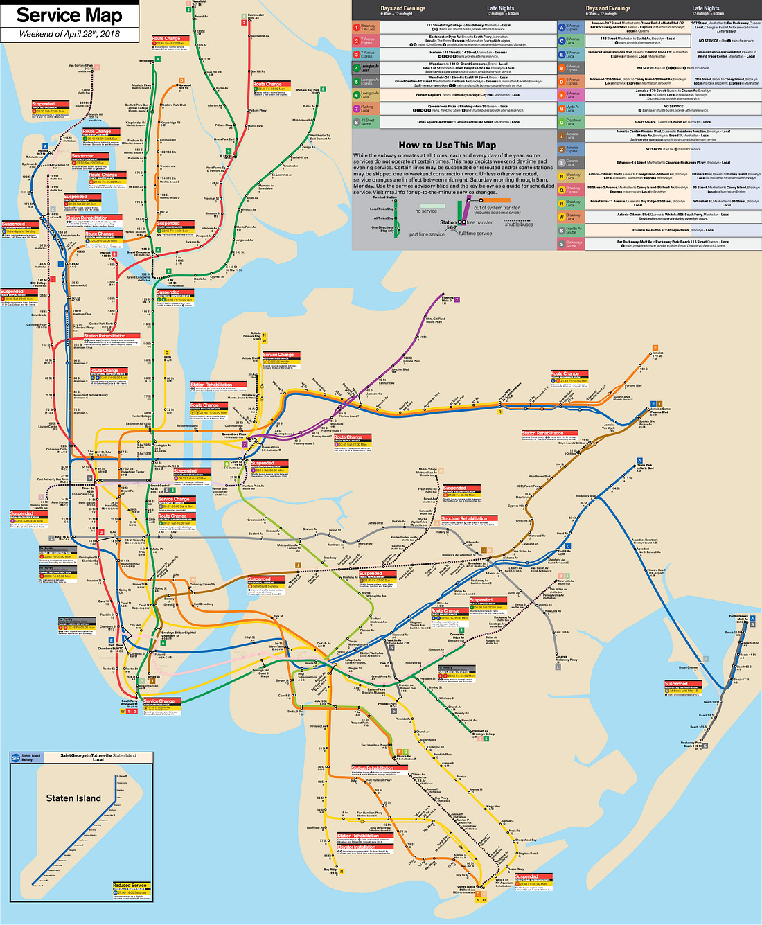
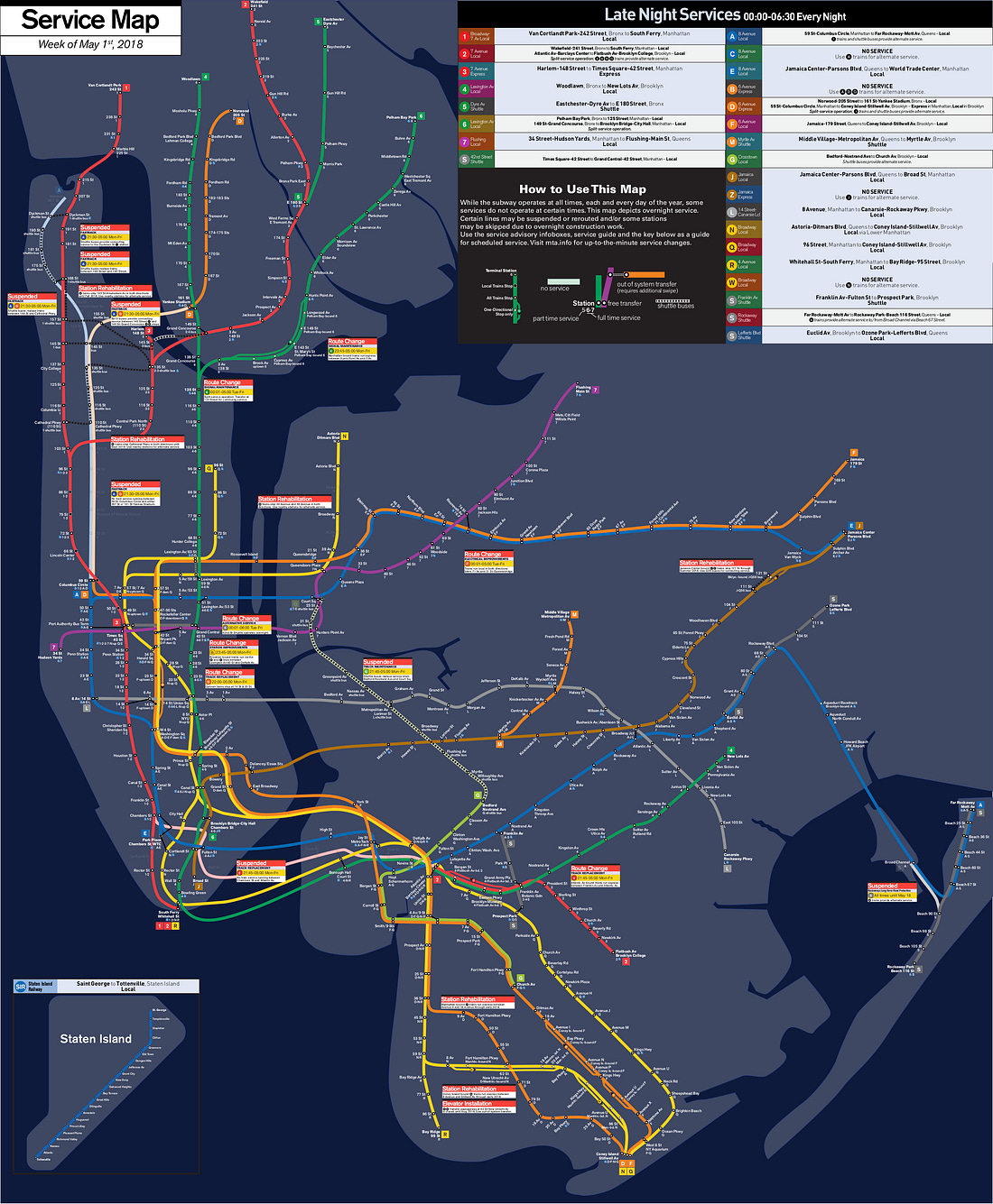
Your Upcoming Service Advisories, Provided by Lance from Subway Weekender
Note: the service advisories reflect the most disruptive changes. Be sure to check the maps or the MTA website for a full list of service changes.
Weekend:
1 - No service between 137 St-City College and 242 Street
4 - multiple diversions
No service between 149 St-Grand Concourse and 125 Street
No service between Utica Av and New Lots Av
All service is local-only in Manhattan
5 - No service between E 180 Street and Grand Central-42 St
7 - No service between Queensboro Plaza and 34 St-Hudson Yards
A C - multiple diversions
Uptown service is express-only between 59 St-Columbus Circle and 168 Street
Manhattan-bound service is express-only in Brooklyn
C - No service between 145 Street and 168 Street
F - No service between Church Av and Coney Island
J - No service between Broadway Junction and Marcy Av
M - No service
Late Nights:
2 - No service between Chambers St and Atlantic Av
6 - Split service operations at 125 Street
A - No service between 59 St-Columbus Circle and 207 Street
D - No service between 161 St-Yankee Stadium and 59 St-Columbus Circle
F - All service is local-only in Queens
G - No service between Bedford-Nostrand Avs and Court Sq
MTA Mention of the Week

Greta Gerwig was on my train car this morning, and I’m taking that as a sign the MTA doesn’t totally hate me, at least not all the time
April 24, 2018Dog in a Bag

Greta Gerwig was on my train car this morning, and I’m taking that as a sign the MTA doesn’t totally hate me, at least not all the time
April 24, 2018Have a dog in a bag photo? Reading this on the subway and see a dog in a bag? Take a picture and send it to aaron.wittes.gordon@gmail.com.
 Photo credit: Eric Wood
With all due respect to the excellent puppers and their humans from previous editions, this is a personal favorite so far.
Hey, since you made it all the way to the end, you may be enjoying this newsletter. If so, I’d really appreciate it if you helped share it with others, perhaps by using the nifty sharing buttons below or telling a few friends using out-loud words. A lot of work goes into making this newsletter every week and this is the best way you can say thanks.

